|
|
|
|
Generate / save
statistical output Once
the functional maps have been generated, statistical details as well as
dynamic curve information can be obtained.
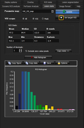
Figure 1: Display of statistical data and histogram for tumor
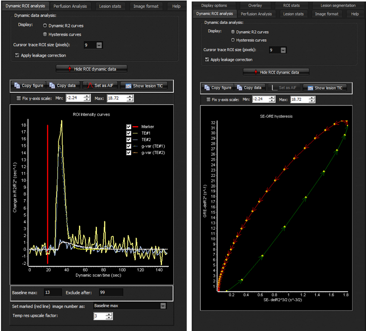
mask in selected output map. Visualization of dynamic time-intensity data Dynamic
data can be visualized in multiple ways from the <Dynamic ROI analysis> menu
tab. If a lesion mask has
been defined, pressing the 1.
<Dynamic
R2 curves> : Displays time-intensity data converted to delta R2/R2* (using
the standard mono-exponential echo time dependence) for the spin echo and
gradient echo series. By default, the curve fits (either gamma variate or
gaussian) to the dynamic curves will also be shown. In this mode, the
baseline (pre-bolus arrival) range can be defined manually by setting the red
vertical line at the appropriate time-point prior to bolus arrival, as shown
in the figure. The line can also be used to define the last time-point to
include in the analysis. By default, all time-points are included. The <Temp
upscale factor> defines the factor by which the gamma-variate or gaussian
curve fit is resampled to higher temporal resolution for better visualization
of the hysteresis curve. 2.
<Hysteresis
curves>: Displays the plot of R2^(3/2) (from SE) along the x-axis
versus R2* (from GRE). This plot is known as the hysteresis plot in VAI
terminology and contains information about the microvascular properties of
the tissue in the VOI. Note that the colouring of the hysteresis curve
indicate the direction of the ‘loop’ Figure
2 shows the dynamic curves from the same lesion mask for the two different
output options.
Figure 2: Visualization of dynamic change in R2/R2* and
corresponding gamma variate (or gaussian) curve fits (left) and the
corresponding ‘loop’ representation using the ‘hysteresis’
display option. Displaying TIC for current cursor position in ‘trace mode’.
|
|